KappaLayout
Abbreviated Java Look and Feel Design Guidelines
Layout and Visual Alignment Rules at a Glance
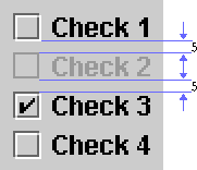
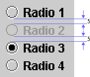
Use multiples of 6 pixels for perceived spacing between components. If the measurement involves a component edge with a white border, subtract 1 pixel to arrive at the actual measurement between components (because the white border on active components is less visually significant than the dark border). In these cases, you should specify the actual measurement as 1 pixel less -- that is, 5 pixels between components within a group and 11 pixels between groups of components.
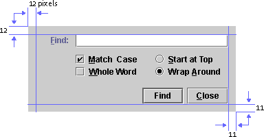
Insert 5 pixels (6 minus 1) between closely related items such as grouped checkboxes. Insert 11 pixels (12 minus 1) for greater separation between sets of components (such as between a group of radio buttons and a group of checkboxes).Insert 12 pixels between items that don't have the flush 3D border highlight (for instance, text labels, titled borders, and padding at the top and left edges of a pane).
Toolbar Button Spacing and Padding
Space individual toolbar buttons 2 pixels apart. Space groups of toolbar buttons 11
pixels apart.
Include 3 pixels of padding above and below toolbar buttons. This actually means
2 pixels of padding below the toolbar because of the white border on the buttons.

The inset on toolbar buttons should be 0.
Command Button Padding
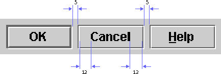
The blank space between the button text and the button border is referred to as "command button padding." Often command buttons appear in groups within a dialog box or an applet. In such a case, the button in the group with the widest text determines the inner padding, as shown in the following figure. Here the Cancel button has the widest text. The padding is 12 pixels on either side of the button text. The other buttons in the group (OK and Help) have the same width as the Cancel button.
Determine which button has the widest button text, and insert 12 pixels of padding on either side of the text. Make all the remaining buttons in the group the same size as the button with the longest text.
Space buttons in a group 5 pixels apart. (Because of the white border on the right side of a button,the apparent spacing will be 6 pixels.)
Toggle Buttons
Although checkboxes and independent toggle buttons have the same function, as a general rule, use checkboxes in dialog boxes and toggle buttons with a graphic in toolbars.
When toggle buttons are independent (like checkboxes) and used outside a toolbar, separate them with 5 pixels. Within a toolbar, separate independent toggle buttons by 2 pixels.

Checkbox Spacing
Space checkboxes 5 pixels apart.
Radio Button Spacing
Space radio buttons 5 pixels apart
Spacing in Dialog Boxes
The following figure shows the spacing you must provide between the borders
of the dialog box and the components in the dialog box.
Design Grids
The most effective method of laying out user interface elements is to use a design grid with blank space to set apart logically related sets of components. A grid divides the available space into areas that can help you to arrange and align components in a pleasing layout. Grids make it easy for users to see the logical sequence of tasks and to understand the relationships between sets of components.
The following illustration shows a sample grid that provides standard margins and divides the remaining space into five columns. Horizontal divisions aid in scanning and interpreting the components and sets of related options.
Use the appropriate layout manager to control horizontal space for the variable width of internationalized text strings.
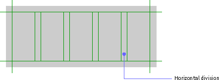
You can use the number and width of components and their associated labels to determine the number of columns in a grid.At the beginning of the design process, vertical divisions are more difficult to set because they depend on the depth of components and sets of components, which are not yet placed.
Developing a grid is an ongoing process. If you know how much space is available, you can start working with the components to determine the most effective use of space. A grid can also help you to determine how much space to allocate to a given set of components. If you can define a grid that will work for a number of layouts, your application will have a more consistent appearance.
For spacing between rows and columns, use multiples of 6 pixels minus 1, to allow for the flush 3D border.
Layout of a Simple Dialog Box
The following illustrations show steps in the process of using a grid to lay out a simple find dialog box.
First, determine the functional requirements. Then add the components according to the Java look and feel placement and spacing standards. For instance, you must right-align command buttons in dialog boxes at the bottom and separate them vertically from the rest of the components by 17 pixels.
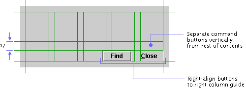
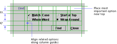
Using the grid as a guide, add the rest of the components. Place the most important options, or those you expect users to complete first, prior to others in reading order.
In the following illustration, the most important option -- the text field for the search string -- has been placed first. Related options are aligned with it along one of the column guides. Spacing between components and groups of components follows the Java look and feel standards.
 Titled Borders for Panels
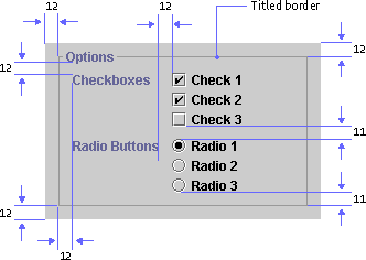
Since titled borders take up considerable space, do not use them to supply titles for components; use labels instead.
Use a titled border in a panel to group two or more sets of related components, but do not draw titled borders around a single set of checkboxes or radio buttons.
Use titled borders sparingly: they are best when you must emphasize one group of components or separate one group of components from other components in the same window. Do not use multiple rows and columns of titled borders; they can be distracting and more confusing than simply grouping the elements with a design grid.
Never nest titled borders. It becomes difficult to see the organizational structure of the panel and too many lines cause distracting optical effects.
Insert 12 pixels between the edges of the panel and the titled border. Insert 12 pixels between the bottom of the title and the top of the first label (as well as between the label and the components) in the panel. Insert 11 pixels between component groups and between the bottom of the last component and the lower border.